

Project 4.1 Simple objects
Exercise: Still life
Make up a still-life group using four or five similar plain, long, unpatterned fruit, vegetables or manufactured objects…Draw the same scene three times using a different medium each time…Concentrate on the positive as well as negative shapes.
I started by experimenting with a group of plum tomatoes, blocking out the negative spaces around and between the tomatoes first and then building up the tones on them. Then a group of oranges, here I just focussed on using different media to block out the negative background shapes.


I wasn’t very pleased with these images as I don’t feel they successfully depict the negative space around solid objects nor give them an anchor in space. The tomatoes are getting there, and on the pencil drawing of the oranges I started to give a bit of definition by shading where the oranges overlap.
Re-reading the exercise outline, I attempted the exercise again, this time drawing the negative spaces around a banana still life.


I still didn’t feel I’d achieved a successful execution of the exercise. You can just about tell that the image is a bunch of bananas, but the outlines are too ragged, there isn’t enough contrast in tone, and they don’t show how the objects relate to the space around them. I was beginning to feel more comfortable with the medium of charcoal, finding it easier to move across the page and vary the degree of pressure I was using. Pen is quite frustrating in that the line that emerges is aways a similar darkness, and the only way to depict light and shade is to spend a long time building up hatched lines or leaving larger gaps between the marks for lighter areas.
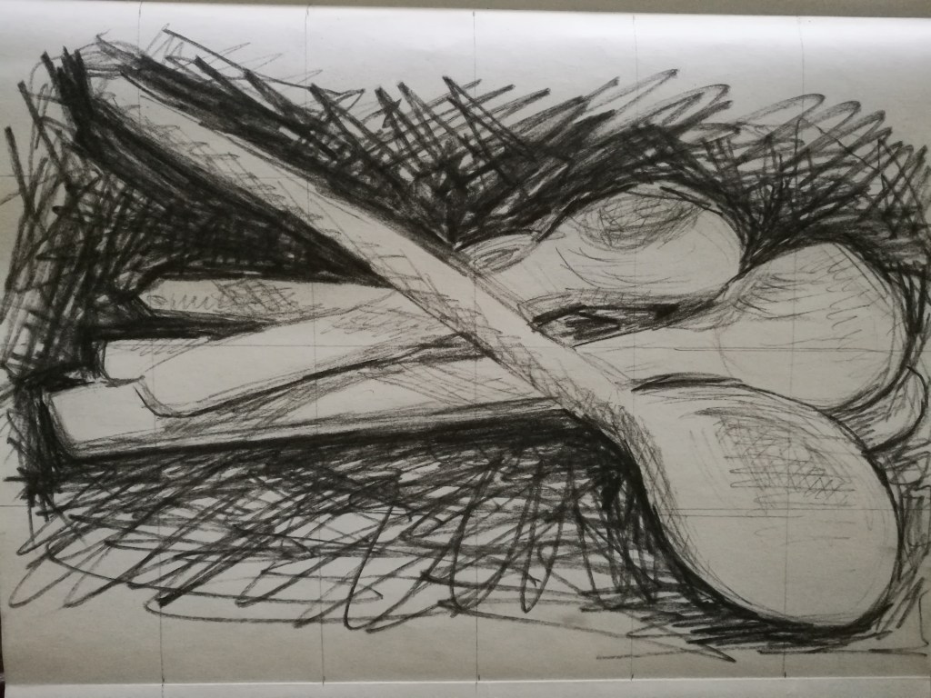
I tried again using a group of wooden spoons.


Starting with pencil, which I’m most comfortable with, I hatched in the space around and between the outside of the shapes made by the spoons. I then looked for the dark and light areas on the spoons. Although it’s an improvement on my previous attempts in the exercise, I don’t think this drawing works in terms of accuracy and depth.
Next, I use a ball point pen. I started with rough outlines of the spoons. There was a short time between this attempt and the last one, so the composition is slightly different. I made rough, quick hatch marks around the outside of the shapes, then worked towards the centre of the composition, trying to match the dark tones on the spoons with those in the background. I continued to repeat layers of hatching over the drawing, trying to achieve areas of light and dark tones. Pen isn’t a medium I’m yet comfortable with, an I need the drawing needs more work to make it more successful.
The final drawing in charcoal was again completed a short time after the previous on, and so the composition is slightly different once again. I tackled it in a similar way to the pen drawing, but with looser, broader strokes and more quickly. I layered up the cross hatching over and over again until I felt the dark and light tones were all captured. I’m quite pleased with the accuracy of the shapes of the spoons this time, but I’m not sure I’ve achieved depth or the spoon’s relation to the background.
I didn’t enjoy this exercise very much, and probably could have spend more time achieving better accuracy.

Leave a comment