

Look at your drawings from parts One and Two of the course…Look for areas that lend themselves to interpretation with thread.
Exercises: Lines, visual and physical texture, tonal variation.
After trying out a few ideas in my sketchbook, thinking about how I might translate pencil drawn line into stitched line:


I chose a few different types of material to work on, and started with thin cotton thread before trying embroidery silk and thicker wool.


To begin with I just thought about creating lines and marks with the thread. Reflecting on parts one and two of the course, I tried to find way to make dramatic and fractured marks, as well as outlines and patterns. I wanted to look at how using the thread marks in a pattern might help create the illusion of shading and tone. As with, the use of drawing lines with pencil, I found that drawing thread lines closer together gave the impression of shaded areas. My preference was using thinner cotton thread rather than the thicker wool I tried out, as, although it took longer I felt the finer lines were easier to control and the appearance is neater. I thought about how I’d create tonal variation with pencil, and decided to replicate this with progressively lighter coloured thread, black through to white. Trying out both tightly knit stitches and spaced out lines, I felt the former was more convincing in giving the affect of shading.

Onto the final pieces. For the first one, I wanted to recreate a sketching exercise I enjoy doing in pencil. This involves using flowing, curved lines one the paper to break the composition up into sections, which I then fill in with different patterns and repeated marks. I’ve given an example below.

After putting some tightly woven fabric in an embroidery frame, I started by drawing the intersecting lines across the fabric without having a clear idea of how I wanted them to turn out, except that I wanted them all to curve a little bit. Once I had different sections I began filling them in one at a time with different lines and marks.


Looking back at drawings from earlier in the course, I continued to find new ways to fill the spaces. I wanted to make sure adjoining sections had some contrast to each other, so if lines are straight or vertical in one space, I made sure the space next to it contained a different pattern or horizontal lines.


I debated whether to leave a couple of sections empty, feeling the effect looks quite satisfying. However, I decided to fill in all of the spaces.

I’m pleased with the finished piece, I feel I’ve created an interesting composition. The fact that I’ve managed to recreate in thread a drawing that I might have produced in pencil is quite pleasing. Filling some of the sections with straight, long lines has provided an appealing and helpful variation next to the areas which have more background showing. I can see how closely laid thread lines have the same effect as those drawn with pencil or pen on paper. It was a time consuming exercise but otherwise enjoyable.
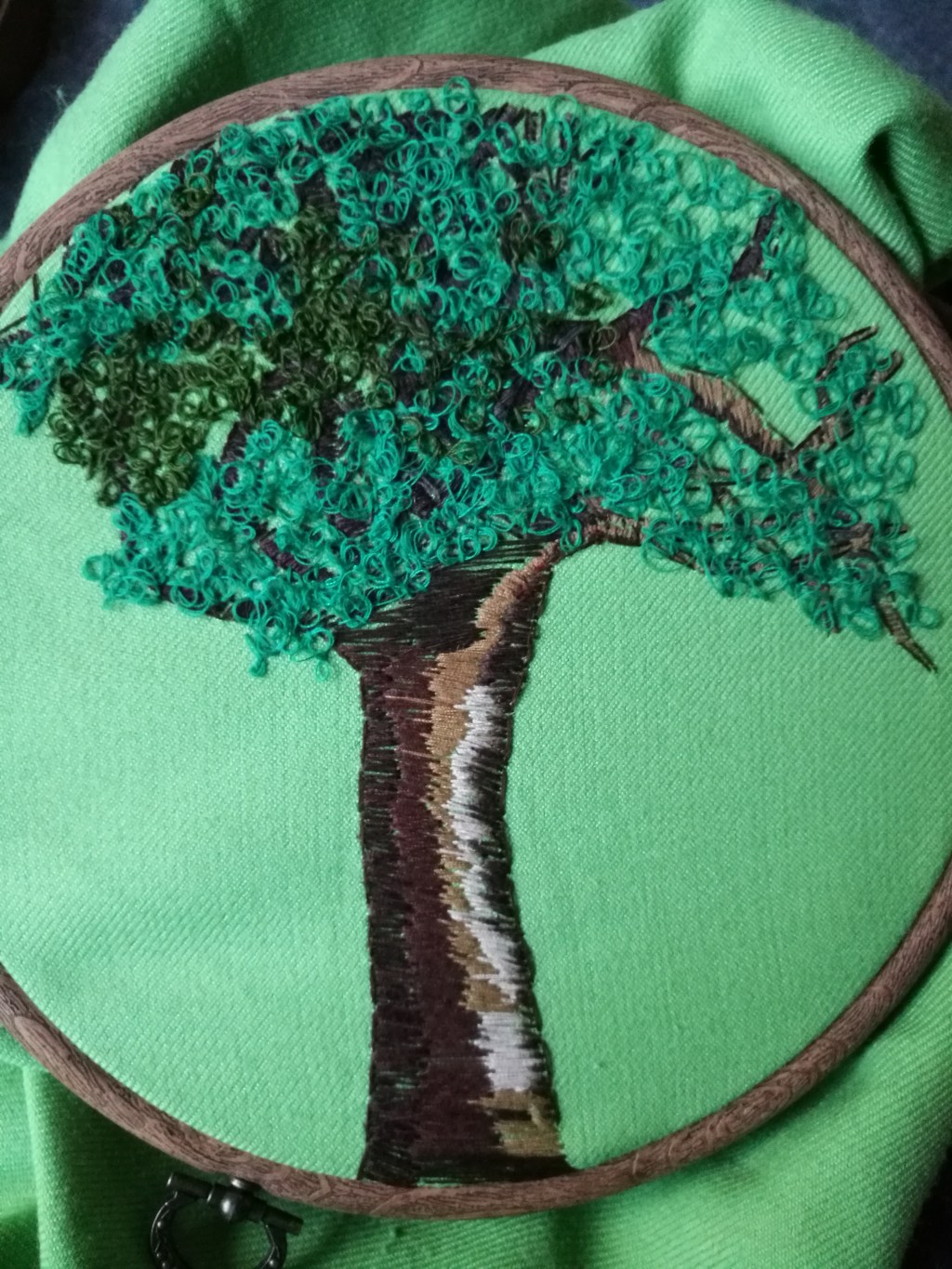
Wanting my second final piece in this exercise to be less abstract, I decided to draw another familiar subject, a tree. I again started by making a few sketches on paper.


Once I was content I had the basic shape of the tree clear in my mind, I began drawing the outline of the tree trunk and branches with dark brown thread on fabric in an embroidery frame.


I used lighter brown thread to shade one side of the trunk and some branches, before stepping back and thinking about how to create the effect of the next branches I drew being behind the ones I’d drawn so far. If I was drawing in pencil, I would create a darker line for the background branches, so I used darker brown thread to draw these branches.


From here I kept thinking about shading with lighter and darker thread, building up shaded areas on the tree trunk and branches.


When I got to this point I took a while to work out how to complete the composition. I was unsure how to blend the lines I’d drawn on the trunk up to those on the branches. To create tonal contrast on the trunk I used lighter thread to give a realistic feel to the shading. I felt I would go back to darker brown for the remaining areas but space the thread lines out a little to convey movement and different facets in the tree.


By now I decided to move on from shading the tree, as the process so far had taken days. I wanted to use a different kind of drawn line to construct the finishing leaf details. To contrast with the straight lines I’ve drawn over the tree, I tried out a loopy line for the leaves.


I continued to build up the loopy leaves over the branches of the tree where I’d left them unshaded. Having run out of the coloured thread I’d started using before covering the branches, I decided to use a darker green thread to hopefully create depth.

The completed drawing seems well balanced, and although it obviously isn’t a completely accurate depiction of a tree, I’m satisfied with the overall image. Again, although it took me a long time to finish this drawing, I found it enjoyable to try creating in thread an image I might have otherwise drawn with pencil or pen on paper.

Leave a comment